Home Bias for Canadians
Past performance is not indicative of future results, but I'm staying invested in American securities.
As I’ve posted about previously, I’ve given up on speculation; I’m convinced it’s a bottomless pit of wasted effort. Still, we must make some choices with our money - choices that are essentially speculation.
As a Canadian, I am well aware that the American market is more diverse and has been more profitable to invest in than my own; so I’ve always been invested in American securities rather than their Canadian equivalents.
I thought I’d check up on the performance differential, so I can at least be informed about what I’m doing.
Assumptions
I’m doing all of this work in an Excel spreadsheet using PowerQuery, in an attempt to keep it simple. Here’s some setup assumptions:
- Two portfolios: USA and Canada
- Canada: 60% VCE (stocks), 40% VAB (bonds)
- USA: 60% VTI (stocks), 40% BLV (bonds)
- Daily free rebalancing
- Fractional shares (perfect balance)
- Date range: 2012 to 2023 (much shorter than I’d like)
Fractional shares actually exist today - it’s not the farfetched assumption it used to be. Daily rebalancing is nuts, of course.
I’m using data from boring-old reliable Yahoo finance, using the adjusted close values so that we are comparing total, dividend-inclusive returns.
Performance Measurement
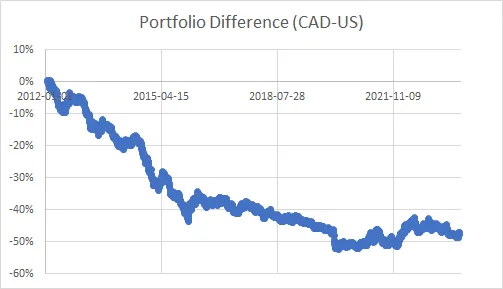
To measure the relative performance of each portfolio, I collected data from 2012 to 2023 and computed - in Canadian dollars - the value of each portfolio. My “Portfolio Difference” metric is then:
$ Performance = Portfolio_{CANADA}/Portfolio_{USA in CAD}-1 $
Which gives us a percent difference in total performance. That chart looks like this:

37% of this total difference is attributable exclusively to the USD/CAD exchange rate. We were at parity in 2012, and as of this writing 1 USD = 1.37 CAD. There’s still about 12% underperformance over this period, ignoring the forex cost.
For this same period, the S&P 500 was up over 200%, whereas the TSX was up a bit less than 70%.
Here’s a huge Tableau visualization of this data on a daily basis, with quarterly quantiles. If you see the darker region of the wick below the zero line, that tells you the Canadian portfolio’s median daily return difference under-performed that quarter.
Daily return difference is kind of a mouthful, this is what I mean:
$Performance[n] - Performance[n-1]$

It’s really hard to draw any conclusions from this chart. Very recently we’ve had some over- and under-performance with no real pattern.
(A Lack Of) Conclusions
It’s speculation for me to keep myself invested in American securities, and it’s speculation for me to sell them and invest in Canadian ones.
As it is, I think I’m just going to stay with the status-quo. Home bias for Canadians has not paid, and I have no reason to believe that will change.
International equity seems to underperform like the Canadian-equivalents, though I haven’t done a similar analysis. Hypothetically I’d like to be globally diversified, but the under-performance of that approach is distasteful.
Perhaps if the USD becomes less dominant this will change. There are claims that the time of American hegemony is near its end. If I could successfully speculate on the timing of that, I wouldn’t be worrying about where to invest a boring risk parity portfolio; I’d be trading foreign exchange futures.
2026-02-22 Update
I have significantly divested from US securities and the US dollar since about 2025-01. It started with a pare down, but at present I have zero US equity exposure. I don’t think threatening your neighbours and alienating your friends is good for business. I won’t support it with my money, anyway.
I track the progress of my choice via https://www.tradingview.com/chart/?symbol=VOO%2FVEU - the ratio of US equity in non-US global equity terms.
